|
Art from Art
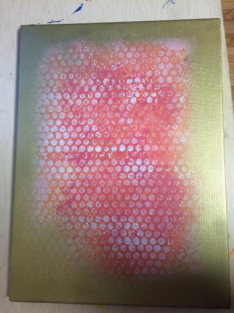
This week in art we approached a whole new method! Usually, you begin on blank piece of paper or canvas but this time we were given the task of making art from art. This was completely new to me since I like making my own art that come from my own ideas but this time, I had to force myself to branch off of someone else's ideas. I chose a canvas that was simple, but pretty in my eyes. It was a mixture of pinks and oranges that beautifully faded together. I then began to use doilies, bubble wrap, acrylic paint and gold spray paint. I meshed everything together and basically kept doing things to it until I was satisfied. I did not have a specific project in mind and just kept going until I was satisfied. In the end, I really enjoy the finished product and am very thankful for the color scheme from the person who did it prior to me! This project turned out to be fun and exhilarating. |
|
Grayscale Painting
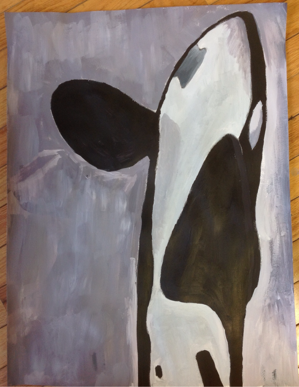
This semester we started a wide variety of new projects. This particular project was painting in grayscale or different shades that very from coal black to off-white. This was not that impressive or exciting to me because I have found out that my calling in art is using as many colors as possible, or for it to just bounce off the place. Colors are my favorite thing to mix and being limited to shades and tints made me nervous considering my comfort zone was being colorful. Now this definitely brought a whole new perspective for my art. I decided to paint an orca or also known as a killer whale. From a young age, I learned about the unfortunately endangered and mistreated species and decided this would be a subtle way to bring awareness for my favorite beloved whales. It was a simple picture I found online of an orca jumping out of the water. Although, orcas are strictly black and white I wanted to show their depth through shades and tints. I used a hint of purple in the back of all the colors from the black to the light white, there is a small hint of purple since I wanted at least a tiny bit of color. It's not very noticeable unless told but it was my way of incorporating my love for color in there somewhere. I actually really like the outcome of my painting and it's extremely different from the rest of my paintings. Luckily, I enjoy mixing colors even just black and white and acrylic is a material I have grown to love so I did not have a tough time with it. I luckily managed to find a way to like it! |
|
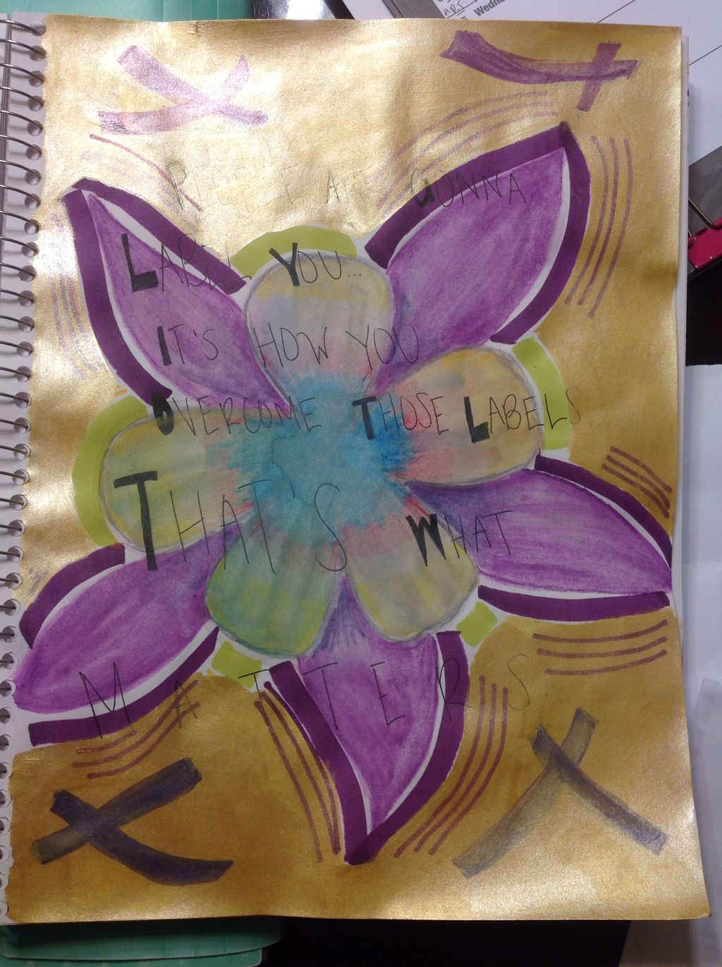
Independent #3
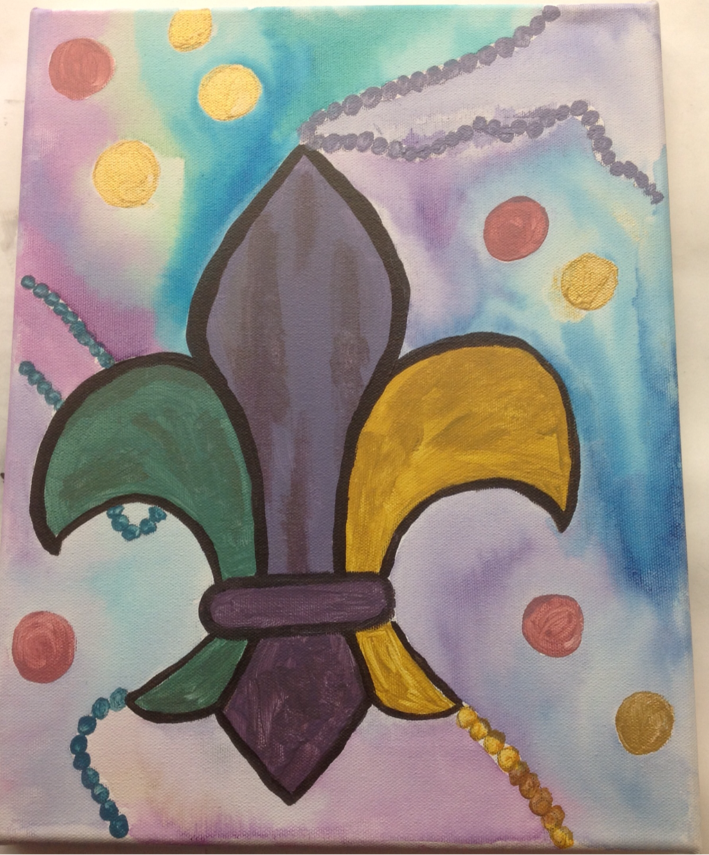
For our third independent we were encouraged to think about our past, present or our future. I incorporated all of them in my third independent! A quick explanation of what it is: a Fleur-De-Lis using "Mardi Gras" inspired colors. I used acrylic paint, water color paint, and gold pigment for this on a canvas. How is this a representation of my past, present and future? Presently, this is the emblem my high school uses for most things so I decided that was a nice representation of the past four years. For the past, obviously, I am a senior so it is paying justice to the last four years I have worn a Fleur-De-Lis symbol on my clothing. For the future, the Mardi Gras is heavily inspired by New Orleans which is one of the destinations in the world I want to end up in. It holds a special place I have grown fond of and hope to visit at least some day, or spend college there. This independent was definitely different from all of my other ones but it is a good way of reminding me of where I come from and want to be in life. |
|
Master copy: Claude Monet
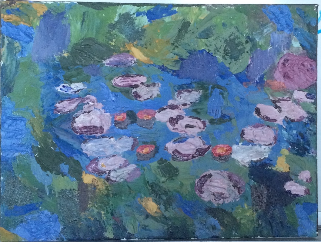
How does one even begin to describe the work of Claude Monet? It is extremely hard to do it justice verbally, you must see it physically to see all his colors, contrasts and depictions he put into his work. I decided to find inspiration from his garden, which he did too because it was such a big part of his life. He spent years drawing it and being dedicated to it, I felt like it was one of his major works and stories. Monet used Impressionism and oil for his pieces he did of his garden but I like to try new things and go big and bold. I chose acrylic paint with the spatula method. You take a lot of acrylic paint on a art knife and begin to smear it onto your paper, or canvas in my case but I decided I wanted his garden to come to life and be 3D like so I mixed modeling paste with acrylic paint and it comes up off the canvas, giving it a whole new dimension. I really enjoyed this project because of all the new things I tried including finishing it off with a gloss gel so it had different textures and finishes and I am really proud of how it came out! The whole experience was smooth, thankfully and I am glad I had such a good time with it. |
|
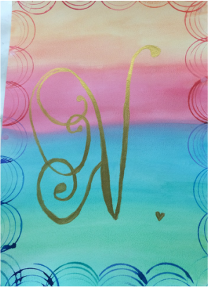
Watercolor #2
In all honesty, I am not a big fan of water color. The fact you can't be detailed with it really bothers someone like me who likes everything being as detailed as possible. Fortunately, I found my way around that. I got inspiration from the sunset and the gradient of colors but I used random colors that I liked and you typically don't see together because I liked the clash. I also stamped around the side with water color that was very concentrated which means you use less water and more of the actual pigment. For the calligraphy V, which is supposed to indicate my name, I used gold acrylic paint but I was going to use black at first. I saw the gold in store and the pop really caught my eye which I why I used it and I think it suits the whole gradient and stamp nicely, but it doesn't over power it. It all comes together, which is what I wanted! |
|
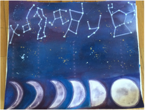
Independent #2
This was one of the most difficult projects I've had to do, but I've noticed that pattern with my independent projects. I always seem to choose the hardest ideas but once you invest in something, you end up caring about it. I am extremely proud of this project! It was made using gouache and acrylic, as well as gold ink and sea sponges. These were all new materials to me which I discovered and played around with myself. The hardest part was making straight lines and being content with the sponging of the moons. I was very particular about how I wanted it to come out and luckily, I achieved it after a long time of debating and trying things out. I really do recommend guache as a material because I loved how it came out. |
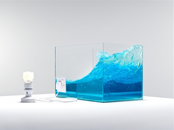
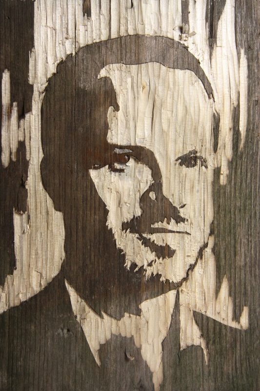
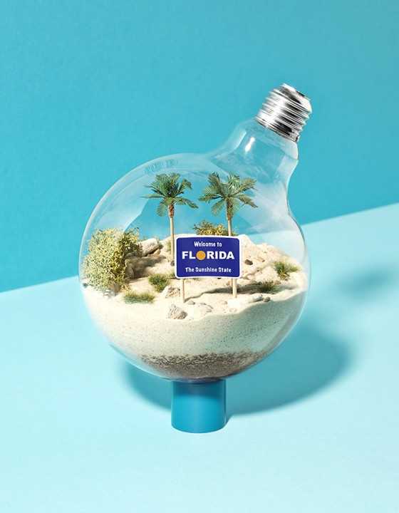
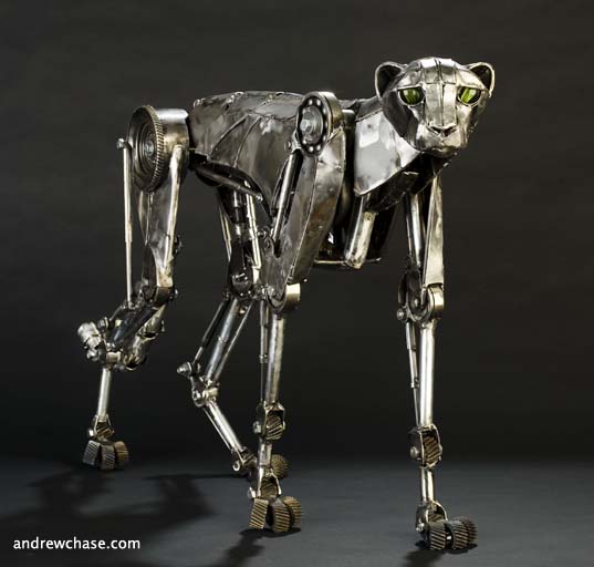
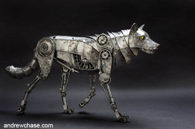
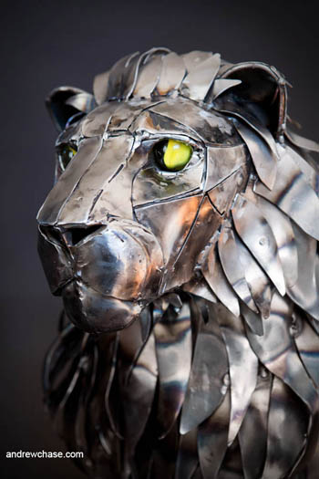
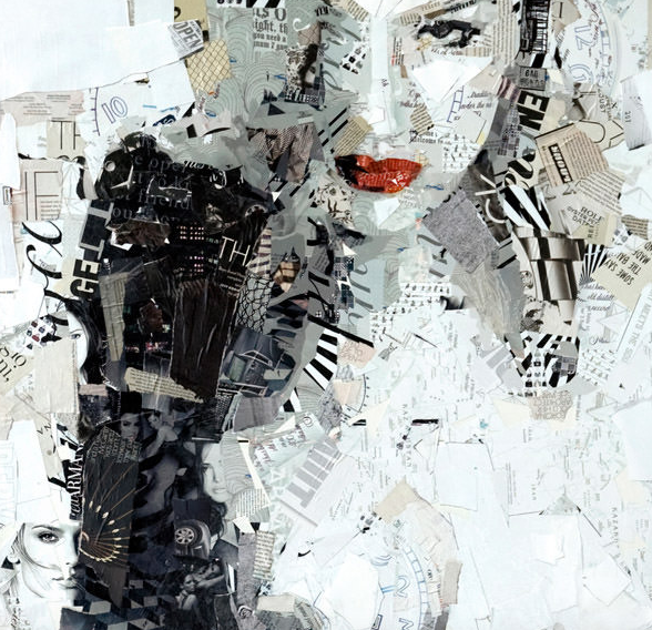
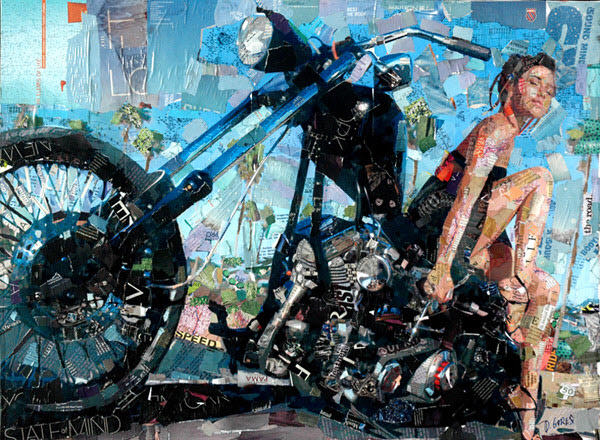
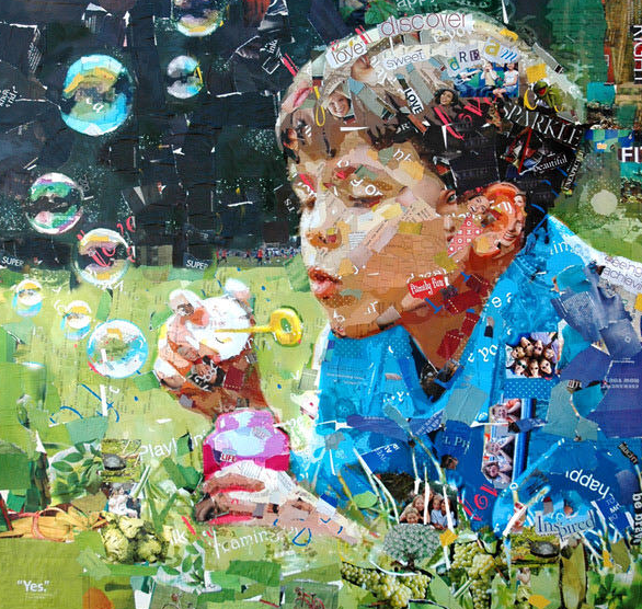
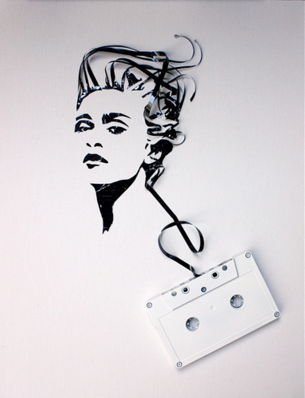
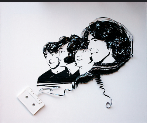
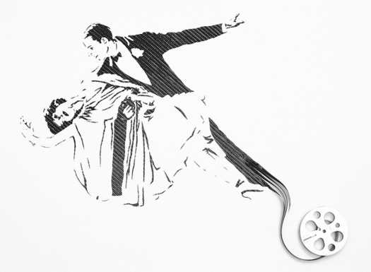
Art... Using Recycled Materials.
Above you will find different art pieces using recycled materials from different artists.
Kyle Bean mostly uses materials to do with the earth such as sand, light bulbs, wood, and things lying around that can be recycled to save the Earth. His art is to show the materials we can re-use rather than simply throw away like most people do.
Derek Gores is known for using materials such as paper and magazines lying around to create a compiled and stacked affect for his artwork.
Erika Iris Simmons uses old cassette tape and pulls out the film to create her art work.
All of these artists are modern and their works I have chosen vary from 2010-2014.
I chose the theme of Art Using Recycled Materials because I have recently done a project on the ways our home, Earth, has slowly been deteriorating. The little things we do are not so little. Throwing out a recyclable material can hurt us in the end and our environment. Certain chemicals and toxins can be spread throughout our O-zone and systems just because we failed to do a simple deed. Plus, these recyclable items can be made into new items and help our Earth be greener. We are currently slowly but surely going through a mass extinction, as I found out, and if we do not start treating our Earth right, we are going to go down with it. Cutting down rainforests, littering and not recycling are the beginning of our huge problem. I think the fact these artists are recycling their materials to make a statement or make a masterpiece of something that is now "used" up is great because they are still using it, rather then letting it go to waste. We need to treat our Earth better and make masterpieces out of the materials we are given just like these artists!
|
Sketchbook Drawings
On the left you will find one of my most recent sketchbook pieces and on the right is my very first sketchbook piece I did this year. I picked these two because you can definitely see the progress I have made from testing materials to actually drawing big and bold compared to small and shy. I somewhat enjoy my sketchbook since it mostly is sketches and ideas but I prefer doing big projects and finished masterpieces. Over all, my sketchbook is a safe haven to use when we do not have a project. It is a good tool to kick back and relax from big projects! |
|
|
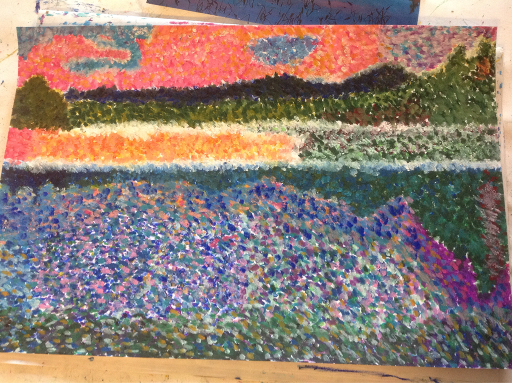
Pointillism Landscape
If there was one word to describe pointillism, it would definitely be vex. Vex is to make (someone) feel annoyed, frustrated or worried which I certainly went through these three stages one by one through the process of my pointillism experience. It was annoying to dot a whole paper for over the course of a week, by the end of it I was so happy to do my last dot! It was frustrating to make the same colors as I did the day before and sometimes it would not work out which would frustrate me even more when they didn't blend seamlessly. Lastly, I was over all worried it would not look good but in the end, I am happy with the perfection in its imperfections of the drawing. Although, it does not blend to my desire and satisfaction I am happy with all the colors and the way it turned out. The beauty is in the tedious process I put into it! |
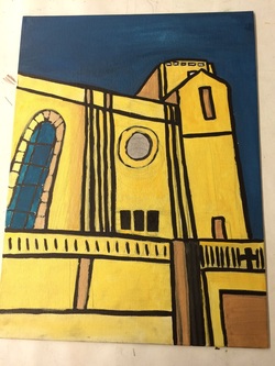
Independent Project
I had a positive experience working on my independent project. Besides all the frustration and lack of hope at times, I ended with a product I am extremely proud of. What I took away from this project is that, the more you invest in something, and care about, you will end up with something you're truly happy about since you put so much time into it.
I chose one of my one photos I took from a couple years ago when I visited Chicago. This church was on the campus of Loyola Chicago which sparked my interest in the Loyola universities around the country. You would think this picture would have to do with my faith but it is actually about college and the future that lies ahead of me. I would love to attend Loyola Chicago or Loyola New Orleans because of the message they put out, and especially their Jesuit community. Beginning with the project, this was the first idea that popped into my head. In my times of frustration, I wanted to start over and do something extremely easier but that wasn't the point of the independent. The independent project is supposed to challenge you, in my opinion!
I used colored ink for the project on a canvas. I mixed a lot of golds and blues and outlined with straight black for a bold effect. I enjoyed using ink because of the bold and bright outcome but it was definitely frustrating to get straight lines when you are free handing it. But, in the end, the imperfections make it what it is. I really like how it came out and I am happy I stuck to the idea no matter how hard it got!
|
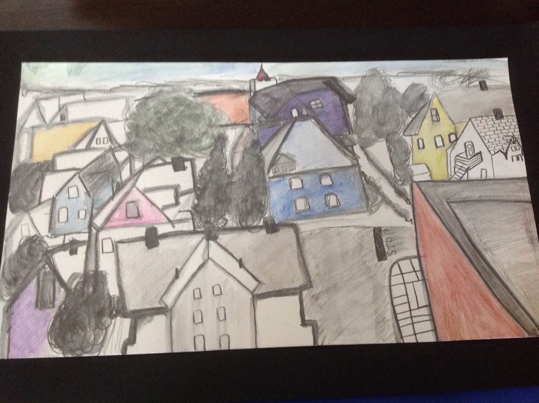
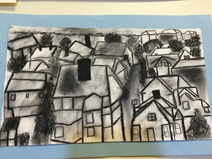
Learning Commons Aerial View: 1&2
You would think drawing houses, trees, roads and everything else from a high view point would be easy– wrong. It is one of the most difficult, and frustrating experiences so far when it comes to art. The thing is, the more frustrated and difficult it is, the happier you are in the end. You put so much time and effort into making it perfect, you will not regret it, at least in my experience. I am extremely happy with the finished products! The one I definitely prefer, though, is the black and white one. The first picture was made using Sketch and Wash along with pops of colors with Watercolor pencils. I also changed locations from one window to another, which made it a whole new challenge. I drew the black and white picture before the other one, and I was so used to my first window, the second one actually brought me head aches. The black and white one was made using charcoal and kneaded eraser, along with my finger tips to blend and erase things. I am extremely glad I got to experience these materials since I came to learn charcoal is one of my favorite materials now. I wouldn't do anything differently since it was a learning process and definitely helpful for future projects. |


|
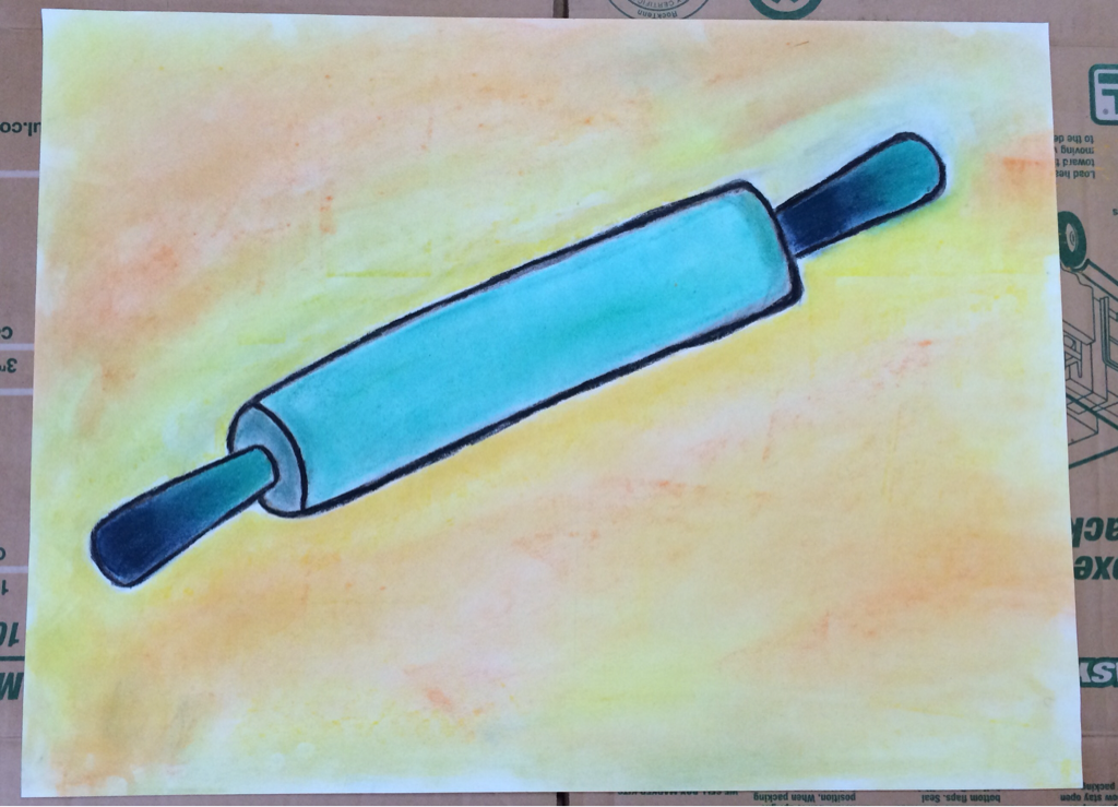
Ordinary to Extraordinary: Rolling Pin
Being able to turn such a simple tool to a new, dynamic, modified way was interesting. Working with both charcoal and chalk pastels, it was tricky at times. I really wanted the colors to show through but also the charcoal, and the more I used color, the more the charcoal seemed to disappear. Having to make cautious and risky steps was an adventure but I would not trade it for anything else in the end. I am extremely happy with how my drawing and colors came out and all the risky steps were worth the product made in the end. |
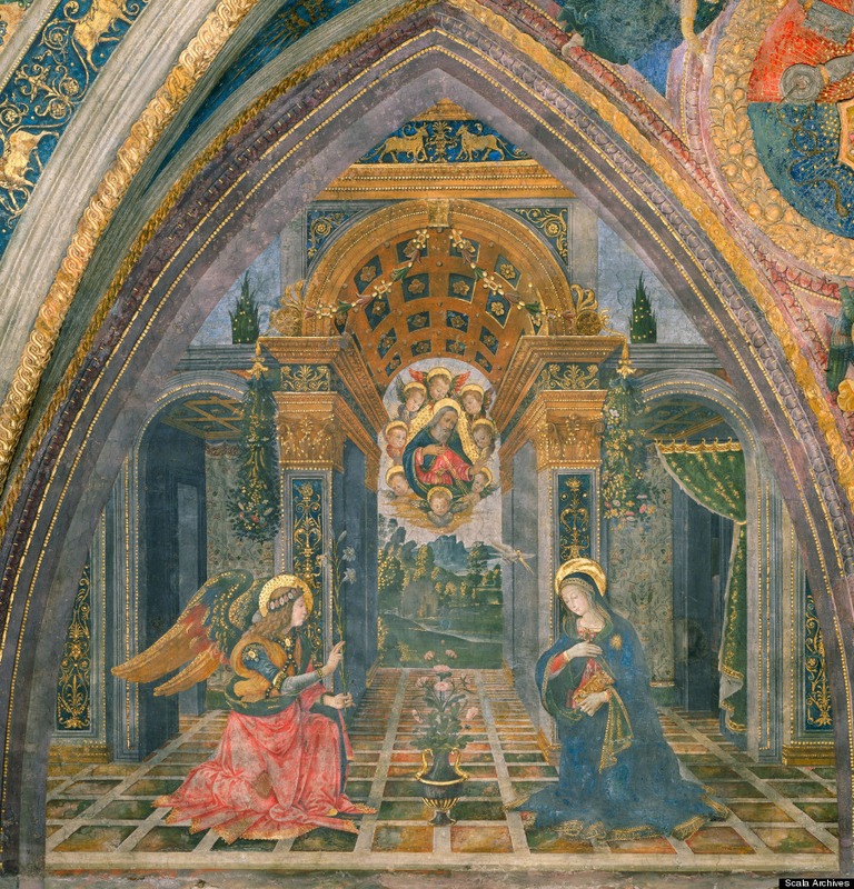
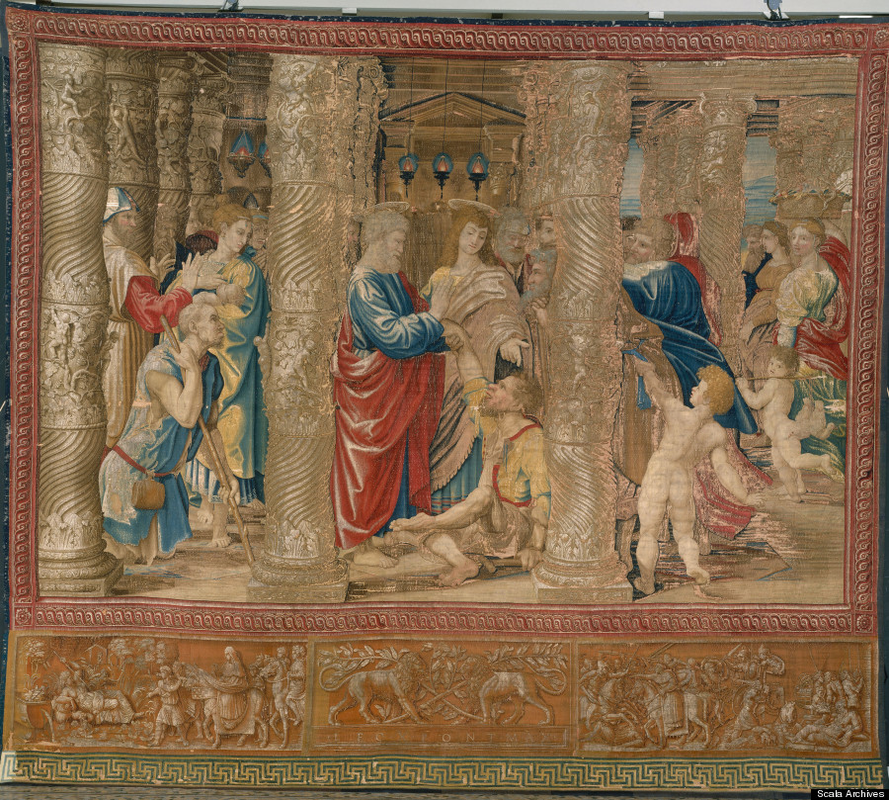
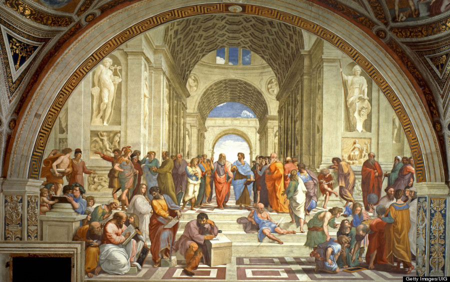
B elow you will find my art exhibition dedicated to Italian art. A majority is located in The Vatican or around surrounding cities. You may be wondering why I have chosen to make an exhibit dedicated to Italian art. It has been a pleasure to be hosting our Pope in the United States and it is a well known fact he lives in Vatican City. This exhibit also represents him and the beautiful art that surrounds him, and may even inspire him. He is free minded and very straight forward, saying his opinions with no shame but he knows his boundaries. He is admirable and I wanted to dedicated this exhibit to him and the city he lives in and cherishes. This exhibit is for our Pope Francis and all the great artists of Italy that represent the country well.
To find out which number corresponds with each picture, go from left to right.
1) The Borgia Apartments by Pinturicchio, located in the Sistine Chapel. The painting is used with frescos.
2) St. Peter Helping a Lame Man by Raphael, located in the Sistine Chapel. This painting was originally on paper but was later weaved into a tapestry for the Sistine Chapel
3) The School of Athens by Raphael Rooms, located in the Apostolic Palace in the Vatican. It's medium is Fresco Painting.
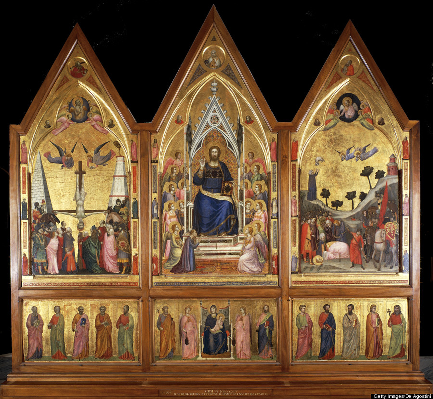
4) The Stefaneschi Triptych by Giotto is in the Pinacoteca Vaticana, Rome. It is tempera on wood.
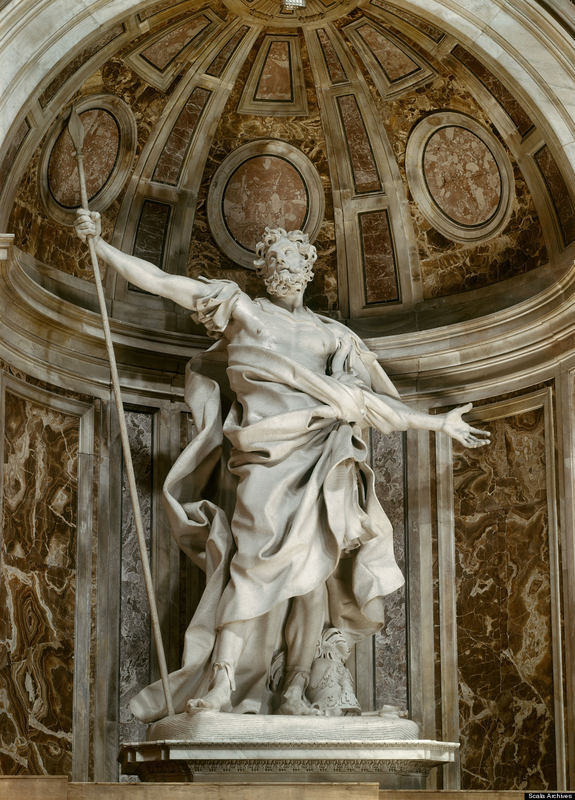
5) This sculpture is Gian Lorenzo Bernini located in St. Peter's Basilica. It is a sculpture made of marble.
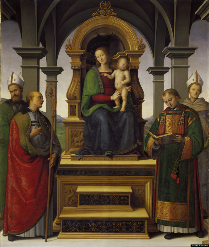
6) This painting is called Madonna and Child with Saints which was made by Pietro Perugino and it is located in Pinacoteca as well. It is made from paint.
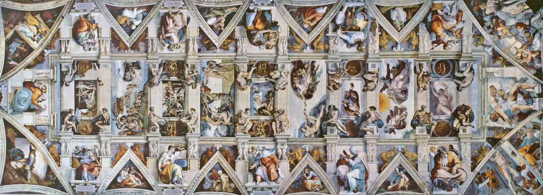
7) This is the Sistine Chapel ceiling located in the Vatican made by Michelangelo using Fresco.
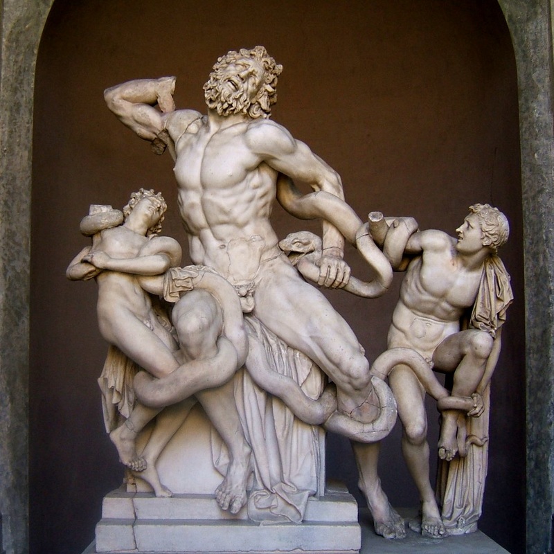
8) This is Laocoön and His Sons by Pliny the Elder. It is located in the Vatican and made of marble.
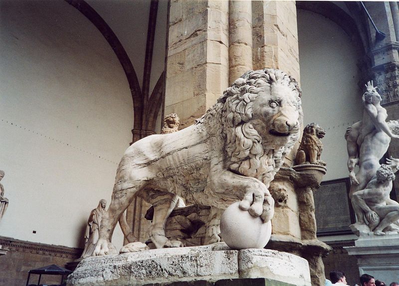
9) These are the Medici Lions located in Loggia dei Lanzi, Florence. They are marble. The artist is Ferdinando I' De Medici.
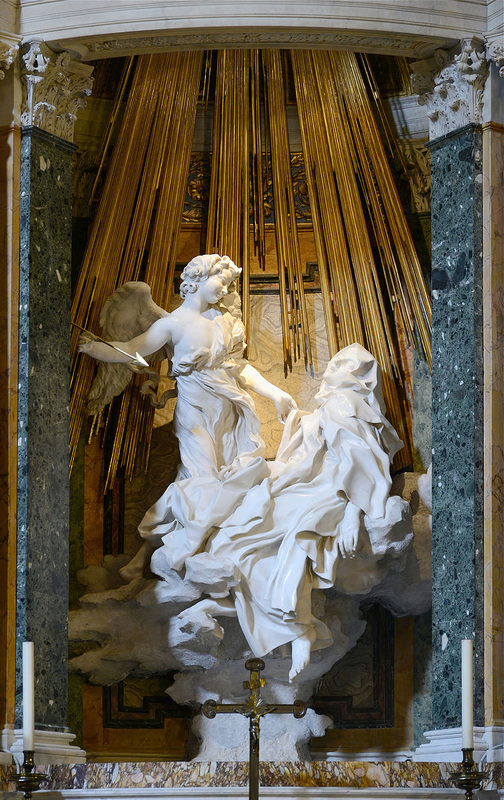
10) These are called the Ecstasy of Saint Teresa, located in Cornaro Chapel in Rome, Italy. The artist is Gian Lorenzo Bernini. The medium used was marble.
*** All of these art works are life size and even bigger. They are on display at museums and chapels located around Italy.
1) The Borgia Apartments by Pinturicchio, located in the Sistine Chapel. The painting is used with frescos.
2) St. Peter Helping a Lame Man by Raphael, located in the Sistine Chapel. This painting was originally on paper but was later weaved into a tapestry for the Sistine Chapel
3) The School of Athens by Raphael Rooms, located in the Apostolic Palace in the Vatican. It's medium is Fresco Painting.
4) The Stefaneschi Triptych by Giotto is in the Pinacoteca Vaticana, Rome. It is tempera on wood.
5) This sculpture is Gian Lorenzo Bernini located in St. Peter's Basilica. It is a sculpture made of marble.
6) This painting is called Madonna and Child with Saints which was made by Pietro Perugino and it is located in Pinacoteca as well. It is made from paint.
7) This is the Sistine Chapel ceiling located in the Vatican made by Michelangelo using Fresco.
8) This is Laocoön and His Sons by Pliny the Elder. It is located in the Vatican and made of marble.
9) These are the Medici Lions located in Loggia dei Lanzi, Florence. They are marble. The artist is Ferdinando I' De Medici.
10) These are called the Ecstasy of Saint Teresa, located in Cornaro Chapel in Rome, Italy. The artist is Gian Lorenzo Bernini. The medium used was marble.
*** All of these art works are life size and even bigger. They are on display at museums and chapels located around Italy.
TBA, by Period 5 Studio.
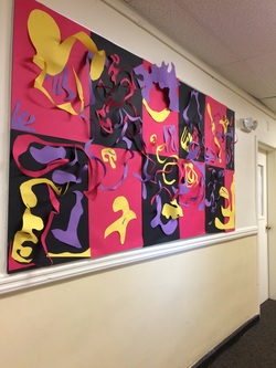
This mural was made by creative minds and a lot of debating. It was a struggle to compose a piece like this because of the amount of ideas and clashing being thrown together in a 45 minute period. It came out to be 3D, and different for the other mural against ours. We had to take many guesses and risks hoping it would come out looking as one piece and not 50 different pieces thrown together. In the end, we thankfully got to collaborate and talk things through rather than doing our own thing. We got together as a group to put finishing touches and agreed on many different pieces to stand out on there own, like the tiny yellow pieces of the red background towards the left. We greed what looked better by testing it out rather than hoping for the best. Creating original art is definitely not easy and it takes a lot of time and effort to make it look put together. If you're working in a group, especially make a mural as one, I would say communication is key and the whole aspect of it. If you do your own thing, that's just one thing, but working together makes it an art piece symbolizing unity. Luckily, my group came to realize that and we came out with a great looking mural that we are proud of and can't wait for others to see our outcome!
This mural was made by creative minds and a lot of debating. It was a struggle to compose a piece like this because of the amount of ideas and clashing being thrown together in a 45 minute period. It came out to be 3D, and different for the other mural against ours. We had to take many guesses and risks hoping it would come out looking as one piece and not 50 different pieces thrown together. In the end, we thankfully got to collaborate and talk things through rather than doing our own thing. We got together as a group to put finishing touches and agreed on many different pieces to stand out on there own, like the tiny yellow pieces of the red background towards the left. We greed what looked better by testing it out rather than hoping for the best. Creating original art is definitely not easy and it takes a lot of time and effort to make it look put together. If you're working in a group, especially make a mural as one, I would say communication is key and the whole aspect of it. If you do your own thing, that's just one thing, but working together makes it an art piece symbolizing unity. Luckily, my group came to realize that and we came out with a great looking mural that we are proud of and can't wait for others to see our outcome!
